Pages

Showing posts with label Tips. Show all posts

Thursday, August 23, 2018

Sketch of a Sketch-note

I got distracted by a bunch of things so I didn't post this right after the Graphic Medicine Conference this weekend - as I had planned.

I was photographed while sketching David Macaulay's Keynote Presentation on Saturday at Dartmouth - and thought you might like to see a little of the progression:

Since I had a lot of lectures to sketch-note and little time between, I composed a template ahead of time with very pale gray lines to help keep me organized. I also made a page for each lecture with the title, the presenter, and any subtitle, also in pale gray - so I wouldn't mess up the spelling. I inked over the pale letters just before each lecture:


I like to draw a quick cartoon of the presenter and put any really good quotes in speech balloons. I don't draw them ahead of time as they tend to look really different in person than in their promo photos!

It's really intense! You have to pay very close attention to what is being said and interpret it quickly. No time to doze off or let your mind wander.

I like to use a black Flair pen and a colored Flair pen as well as a cool Japanese brush pen that has black on one end and gray on the other. I work on a magnetic portfolio/clipboard... usually on my lap!


One of the most difficult things is planning! Some presenters cram so much material in - it barely fits and you have to leave stuff out when you run out of space. If someone doesn't fill the page, that's easier - I just add some more graphic elements to fill the voids.


Then I add the grays for shading and contrast. It also helps divide up the space and the information and make it easier to read. Borders hold it all in!


Since he is one of my heroes, I also wanted to show you some of David Macaulay's work in case you aren't familiar with it. I think he is best known for these two books:


And they were the focus of the Graphic Medicine talk.

He's a genius at showing how architecture works too - Cathedral and Underground are classics...


And he has lots of picture books too.

My absolute favorites are Motel of the Mysteries (Discovery of Tutankhamun's tomb parody!) and BAAA (people are sheep... but what if sheep were...people? Spoiler, it turns out badly). 
My copies are so old the glue has let go and the pages are falling out!


I got mine signed back in 1991! 


I was a student at RISD and David Macaulay took over as the Head of the Illustration Department.


I had already been at two colleges and hadn't been able to convince any schools to transfer my credits. I was beyond discouraged and tired of being in school (5 years at three colleges!) David took a look at my transcripts and said "Want to graduate with the Seniors this Spring?"
"I love you Mr. Macaulay."

It took me 25 years to go back to school (for my Masters) and finally do school properly. And I ran into David at the Center for Cartoon Studies a few years ago.

I've always been grateful to David Macaulay for releasing me from the academic world and for showing me how warped and ingenious kids' books could be! 

Saturday, July 7, 2018

Illustrator Saturday!

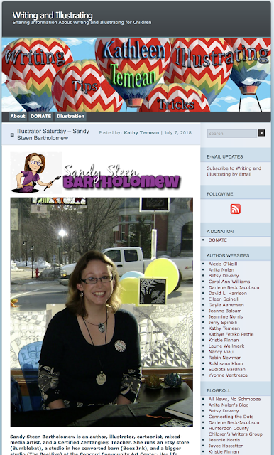
I am SO excited to be the featured artist on Kathy Teaman's WRITING and ILLUSTRATING blog for Illustrator Saturday!

 Click HERE to read the full post and see the images!

Click HERE to read the Interview and see all the images on Kathy's blog.

And here is just a little preview:

How long have you been illustrating?
More than 30 years.
What and when was the first painting or illustration that you did where someone paid you for your artwork?
I think it was in High School… I did comics for a local newspaper. I also painted the windows at our comic book store!
Did you go to college to study art?
No. And Yes. I went to summer programs at art schools when I was in High School – but I was expected to go to a “real” college. I went to Brown University to study Egyptology. I left after a while and went to the School of Visual Arts (NYC), then to the Rhode Island School of Design.
How do you find illustration work?
I trip over it. Seriously. It never comes from where I expect… marketing? Nope. Someone sees my work in the science museum while shopping with their kid…
What is a Certified Zentangle Teacher? How did you get certified?
Zentangle® is a meditative drawing process. It’s blasphemy to describe it this way, but it’s “focused doodling”. I was one of the original guinea pigs in the certification program – class #1!
And I wrote the first books on the subject. It changed my life – it’s kind of “trendy” now – but it’s true magic is that it teaches “creative confidence”.
Click HERE to read the rest of the Interview.


Wednesday, August 3, 2016

Behind the Scenes - "Nesting Instinct"

I admit I have an ulterior motive here.

Usually, I would post this kind of behind-the-scenes thing on the Glyphs & Glitches blog. But if you aren't following that blog, or the Comic Blog, I want you to know what you are missing! ;-D

If you'd like to see more like this, and learn about interesting artists that visit my school, then you still have time to back my Indiegogo project. You'll also get pdfs and fun stuff throughout the year. Take a look HERE and share the link with your friends (Thanks!)

Here's a behind-the-scenes for a recent comic page, "Nesting Instinct"...

I start with a rough sketch of the panels (boxes) and what I want to happen in each box, then I begin adding more details (in pencil)...


I used to make the lines with a ruler and also rule out all the lettering guides... but now I just freehand them. Either I am lazy or I LIKE the slightly wonky look.


My favorite part is the inking. For these journal-type comics, I use a PaperMate ballpoint pen (sometimes a BIC Crystal pen). I Trace over the pencil lines, but also add more details and refine (look at the lines on the squirrel's purse). I put in some "shading" and crosshatching with the pen now - I will add more later, after the pencil is erased.


When I erase the pencil lines, some of the ink gets rubbed off too...


... so I go back in with the pen and add the dark areas and shading. Compare the acorns in the panel above, with those in the panel below...


I work in a Moleskine journal that has very thin paper and it is creme colored. The book is lightweight and convenient to carry with me everywhere. But it's a pain for scanning. If I were working on bright white paper with dark black ink and no grays... I would scan it, threshold it, and call it a day!

But I insist on doing things the hard way - and I really like the "sketchy" look of the ballpoint pen and the many grays it creates. That means that I have to eyeball it when I'm adjusting the lights and darks. I want to get rid of any stray pencil marks, but not lose the grays from the pen. Then I have to zoom in and do a lot of careful erasing and adjusting. Lastly, I'll straighten any seriously wonky panel boxes or off kilter text.

Here's the final comic page:


If you'd like to read these comics as they are posted, please back my Indiegogo campaign!
If you are reading this after it has ended, take a look at my Patreon page.

Friday, August 14, 2015

Behind the Scenes - The Glyphs & Glitches Banner

I have discovered two drawbacks (pardon the pun) to having my art supplies neatly organized in mugs on my drafting table.
1. They are much more appealing than my daughter's disorganized materials.
2. They are easily removed from my drafting table...


Although I have to admit that I also work on the floor... the bed... the couch. Which is why my supplies are so portable.

So what have I been doing on my actual drafting table?
I thought I would show you how I created the header for my Glyphs & Glitches blog. This is also the same design I used for the project image on Kickstarter, with a slight shift to my cartoon character.

If you have been curious about the Kickstarter Project and wondering what the blog will be like, this post will give you a good example.

The Process:

This was the original blog header:


It's a pencil drawing I had done of canopic jars - to go along with the Egyptian "glyph" part. And if you have canopic jars in your life, you definitely have a "glitch" or two. (Canopic jars were used to store the organs when a person was mummified).

I updated it to be more relevant to cartooning and added my avatar "thinking"...


But my art directors didn't think anyone would "get" it. My sister (art director #2) suggested I start over and have me thinking about my kids and cat, since that is what I write about... with cartoon accents. Fine.

I started with a pencil sketch of the kids sitting on the sofa with Minou sprawled on the back.


The Lilah Beans found their way in and, as usual, started interacting with the other characters. One is pulling Alex's ear, one is sleeping on the cat's paw, another is petting Lilah... and I tossed a Bumblebat in too, just hanging around.


I inked over the pencil sketch with brown ink for the kids and dark gray for everything else.


I added the tangle, Printemps, in the background in light gray ink because I tend to put it anywhere I need to fill space. Swirls appeal to my chaotic mind...


I added more brown to the kids with crosshatching, then darkened the shadowy areas with black pen.


 I really liked this 3 color drawing. This is where I also get stuck. Keep it simple? Or push it with color? Agh. Once again, the art directors decided "color!" And I thought - yes, that could work... just as I liked the contrast between the slightly realistic drawing and the cartoon drawing, I thought I could use the monotone cartoon against the colored reality.

I didn't really think that hard about it, I was getting desperate to get to work on the rest of the Kickstarter project!

So I scanned the art into Photoshop (actually I use Photoshop Elements, but I intend to learn all about the "real" program in school).


 I created a new layer to do all the color work. When I hid the line layer, it looked a little creepy! Notice the Lilah Bean's pink cheeks just floating in space?


But all together, I thought it worked...


I added my cartoon character thinking about it all, and the type, and then resized it to fit the width of the blog header. This is an actual screen shot from the blog:


The project image on Kickstarter has to be in a square format, so I rearranged the bubble, me, and the text:


For now, the material on the Glyphs & Glitches blog is reposted from this blog. This post will also be put on there. If... WHEN... the Kickstarter is funded, posts about cartoon school and step by steps like this one, will only be available on the G&G blog. You will still be able to get access to it, but the price will be higher. 

There will also be more detail, and school will have started and the posts will get crazy exciting!

All that to say - please, please, please! back my Kickstarter project as soon as possible. There are only 13 days left to fund it.

To all of you who have already backed it, thank you so much! Now, get your friends to do it too! ;-)

Tuesday, July 21, 2015

Getting Toned (on Paper!)

If you follow Zentangle trends, you have been seeing a lot of posts about tangling on toned papers. Tan or gray are the most common. Sea shells, flowers... very nice. But I like to be a bit different - or weird, maybe? So I am going to share some behind the scenes pics for a large drawing I did about a year ago on Strathmore Toned Gray paper (see the end of the post for details on the paper).

My inspiration for the drawing was a stone wall pillar in the corner of my apartment. For some reason, as I was staring at the wall... I started to see creatures emerging from the rocks! 

(Go ahead and try it for yourself. I'll wait...)


So I sketched the creatures in my notebook.


...and then redrew them onto the gray paper using pencil and then, a Micron pen.


 Using different sizes of Microns, I added tangles to the entire background. I was thinking of deep-sea creatures, so the tangles are kind of sea-weedy and bubbly.


I added more pencil shading behind the creatures in order to push back the background and help the critters pop out a bit more.


Next - I used a white Prismacolor pencil to add some highlights on the backs, foreheads and noses...


Here's a close-up with some highlights...


I used a Prismacolor black pencil to add the darkest darks to the underbellies and crevices. And some details like eyeballs and mustaches!


And there we are. 


We used to carry these Toned Papers in the store (the BeeHive). Today, I took the remaining inventory and put it on my Etsy shop (Bumblebat) The paper is available in gray or tan - and then you can choose between hardcover, or spiral-bound sketch journals. And the hardcover journals come in 8.5 x 11 or 5.5 x 8.5 inch sizes! So many choices.

The one I use in my example is the larger, hardcover, gray paper journal.  The spiral bound sketchbooks are great if you want to remove pages (they have micro-perforations) to frame or to cut up for smaller artworks, or for use in classes.

And to thank you for reading all-the-way-to-the-end... here is a coupon code for my Etsy store: BLOGLOVE

Enter the coupon in the promo code box during check out, and you will get a 15% discount. It's good until the end of July, on purchases over $10.

Now go draw something!

Saturday, December 13, 2014

November Journal Pages

Feels like we jumped right from Halloween to Christmas - but when I think hard about it - there was a lot that happened in November. Makes my head spin thinking about it all. December is moving just as fast. I'm getting those weird fantasies again about a week spent just "puttering". At home. Maybe with someone leaving meals for me on the doorstep...

For now, here are my Journal52 pages for the month of November:

Week 44 - Skyline
Uni Pin Pen, Tombow markers, waterbrush

I strayed a little above the "skyline" but had fun making a sunset in the background with the markers and blending with the waterbrush.

© Sandy Steen Bartholomew

Week 45 - Thinking of You
Pilot brush pen, pencil, watercolor, solid tempera paint crayon.

I find that song lyrics help me to focus my ideas for these prompts. This song, "Try" by Colbie Caillat, has been haunting me lately. It makes me so sad. I have met so many people - mostly women, but a few men too - who are trying so hard... but still aren't happy. And this time of year especially, I find myself wondering, "Why am I doing this? ... this isn't ME."

That's not really lipstick on the mirror - it's a very cool hybrid product. It's kind of like the Gelatos, smoodgey and silky, blendable, but it dries like paint. 
 
© Sandy Steen Bartholomew


Week 46 - Napkin
Sharpie Pen, dinner napkin, fingerprints

It was just before Thanksgiving and not a single interesting napkin in the house! Time to remind myself that I am OCD, not a perfectionist... it only needed to be "finished" not "perfect"! This quote gave me another reason not to feel bad that I don't host Norman Rockwell worthy Thanksgiving parties.
 
© Sandy Steen Bartholomew


Week 47 - Wise Words 
Sharpie pen, Staedtler Fineliner Pens

I think this has been my year for playing with lettering and quotes! I work with words and pictures all the time, but separately. I love the idea of playing with them combined... illustrated letters and letters that form the illustrations.

This page uses the Staedtler pens I mentioned in the recent coloring book post. [If you are interested, I added some more art to that post with these pens - scroll down near the bottom to see it.]

© Sandy Steen Bartholomew

LinkWithin

Related Posts with Thumbnails